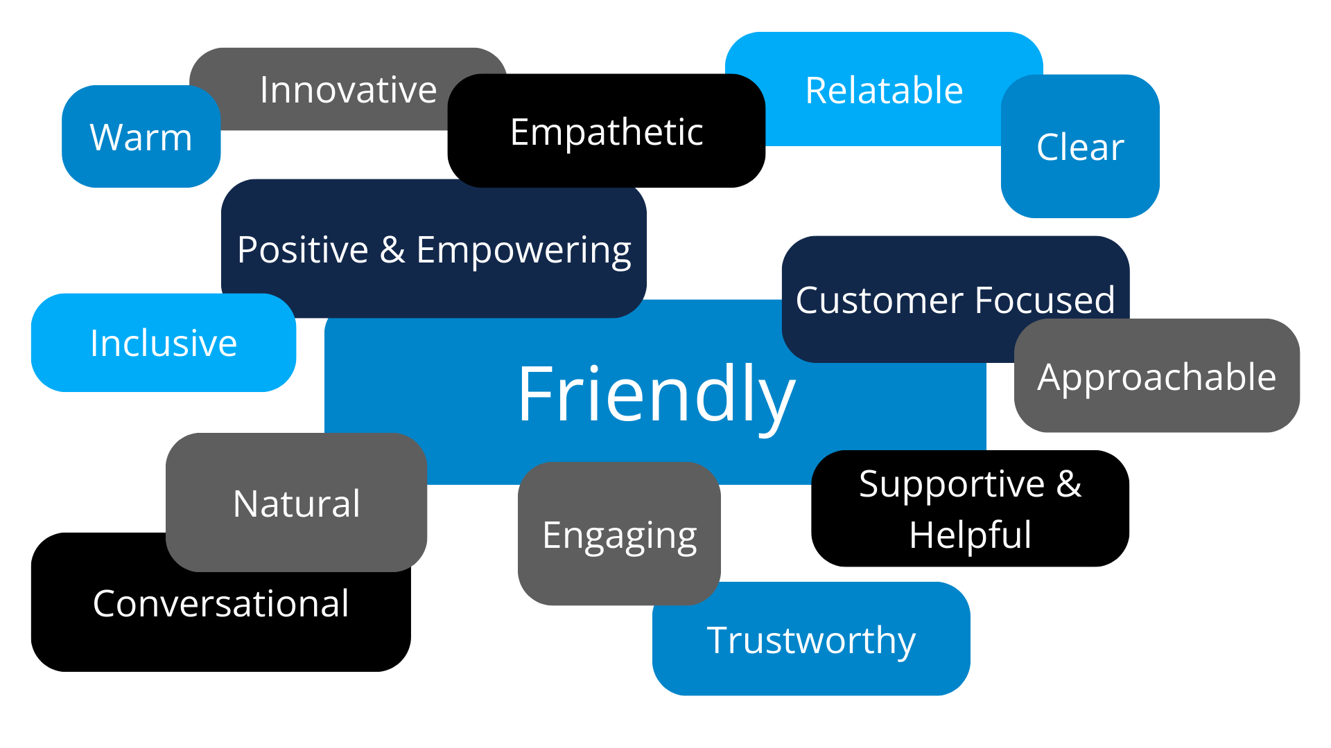
Our brand is more than just a logo or visuals—it reflects who we are and what we stand for.
By following these guidelines, you help maintain a recognizable image that reinforces trust, strengthens connections, and highlights our value.
Consistency is key to making JAS instantly recognizable in a competitive market. These guidelines ensure that every representation of JAS is accurate, consistent, and professional.
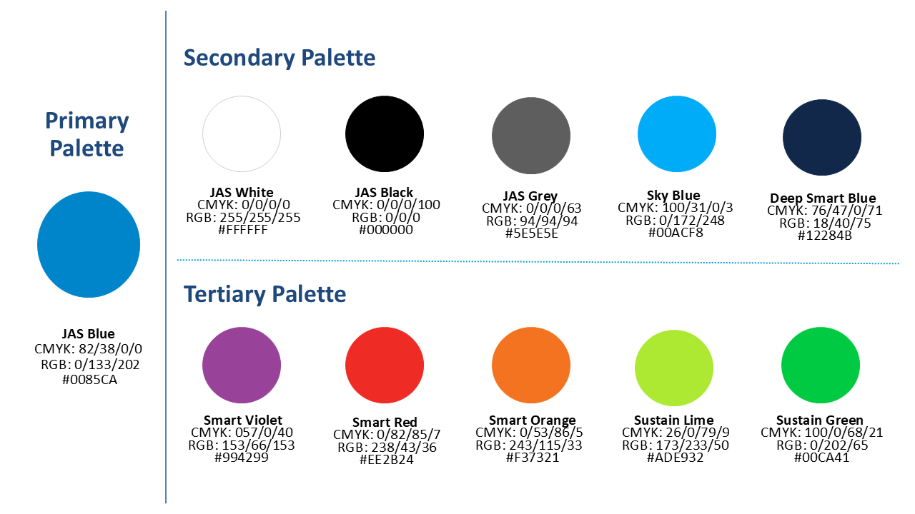
JAS Blue is the foundation of our brand’s identity. Lighter and darker shades of JAS Blue can be used in 10% steps to create contrast and add variety. Secondary colors can be used to enhance a design, but JAS Blue should always remain the primary focus.

Choose dynamic, high-quality images that reflect excellence, innovation, and collaboration. Focus on real-world moments that showcase teamwork and problem-solving in action.
Use clean, simple icons that reflect the JAS brand. Keep details minimal, line weight consistent, and colors within JAS’s primary and secondary color palettes. Icons should visually support the message while maintaining a cohesive, uncluttered style that enhances clarity.
The Forward Arrow is a signature element of JAS’s visual identity, symbolizing progress and momentum. It guides the design of diagonal paths and graphic elements, creating a sense of movement.
Angle:
- Diagonal paths and shapes should follow a 55.5/-55.5 degree angle, derived from the Forward Arrow.
Usage:
- Use to visually emphasize JAS’s dynamic and forward-moving nature. Always position the arrow left to right to reinforce this sense of progress.
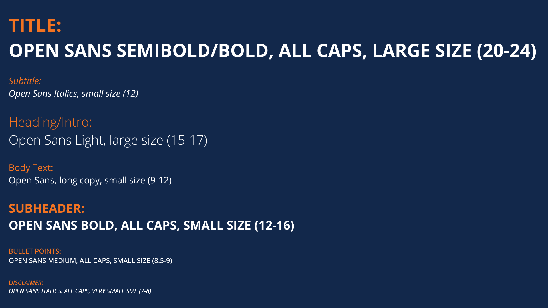
Font
- JAS’s primary font Open Sans is used across all marketing materials.
- For website and desktop applications such as PowerPoint, Excel, and Word, Calibri serves as the substitute font when Open Sans is not available.
Style Hierarchy
- These guidelines apply to standard print materials such as flyers (8.5”x11”). Scale as appropriate.
The JAS logo is a key part of our identity, and using it in accordance with the brand guidelines makes our brand instantly recognizable. Always use the provided logo files and follow the guidelines for color, scale, and white space.
- The margin around the logo should always be at least ½” wide.
- Use the white version of the JAS logo on backgrounds darker than a medium shade of gray (or 50% black).
- The logo should only appear in JAS blue, white, or black (for grayscale printing).
- Do not skew the logo or add 3D perspective.
- Do not add additional information or elements to the logo.
- Do not change or vary the colors of our logo.
- Do not use the old logo.
Purpose & Application:
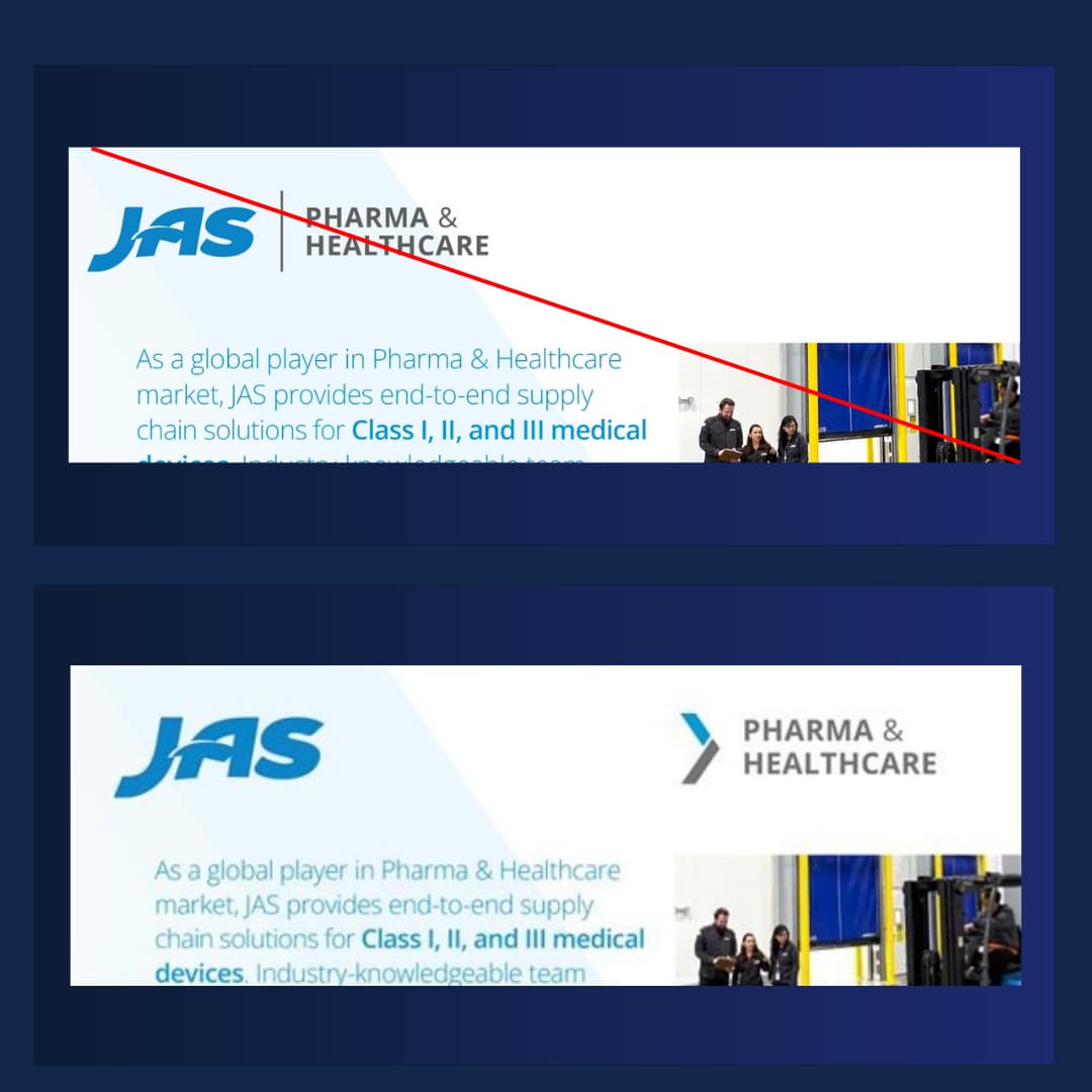
- Vertical badges are secondary branding elements designed to complement the JAS logo.
- The JAS logo should be applied first.
- Use the vertical badges on marketing materials such as cover pages and flyers.
Placement & Sizing
- Position vertical badges on opposite planes from the JAS logo.
- Use the same spacing, sizing, and color rules as the JAS logo.
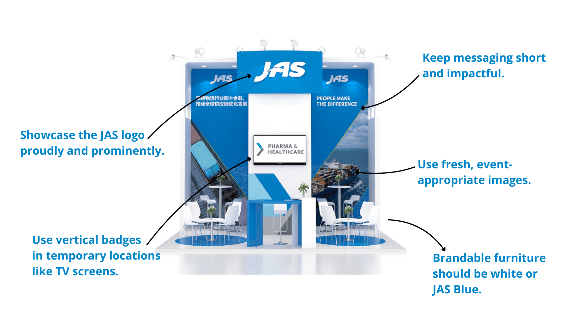
Trade shows are a key opportunity for JAS to showcase its expertise, engage with potential customers, and reinforce brand awareness. These guidelines ensure that every booth maintains a consistent brand presence, creating a professional and engaging experience for visitors.